REVIVETHECOOL X 7MINDSETS
Education Platform Refresh
Improving access to educational resources and materials for students and teachers.
Refreshing 7Mindsets' Courses and Resource Pages with Global Search
7Mindsets had previously worked with another design agency for its internal portal redesign but needed further design iterations. I partnered with the agency, Revivethecool, to refresh the UX and UI of two major pages on the site: the "courses page" and the "resource hub." These pages, frequently used by teachers and students, required a modern update and improved user experience.
Initially, we had limited information and worked with a liaison who was removed midway through the project, causing confusion about requirements and scope. We took over the previous agency’s Figma file, parsing through mocks and information to determine the next design phase. Additionally, the client requested the addition of a global search functionality.
Creating discoverability through filters, search, and course visuals for a more intuitive and easy user experience.
Research & Analysis
We had access to the developer’s internal site, but found inconsistencies with the Figma file based on the previous design agency’s work. This confusion was due to unclear communication from the brand side about the other agency's decisions. Our task was to better utilize space on the courses page and improve functionality.
We hesitated to act on requests without understanding their rationale or user relevance. We broke down the courses page and resource hub to clarify 7Mindsets’ vision for the redesign. Through iterative design phases and feedback, we established a productive partnership with the head product manager and developer, who provided valuable insights into the site's complexities and nuances, allowing us to understand our limitations with design.
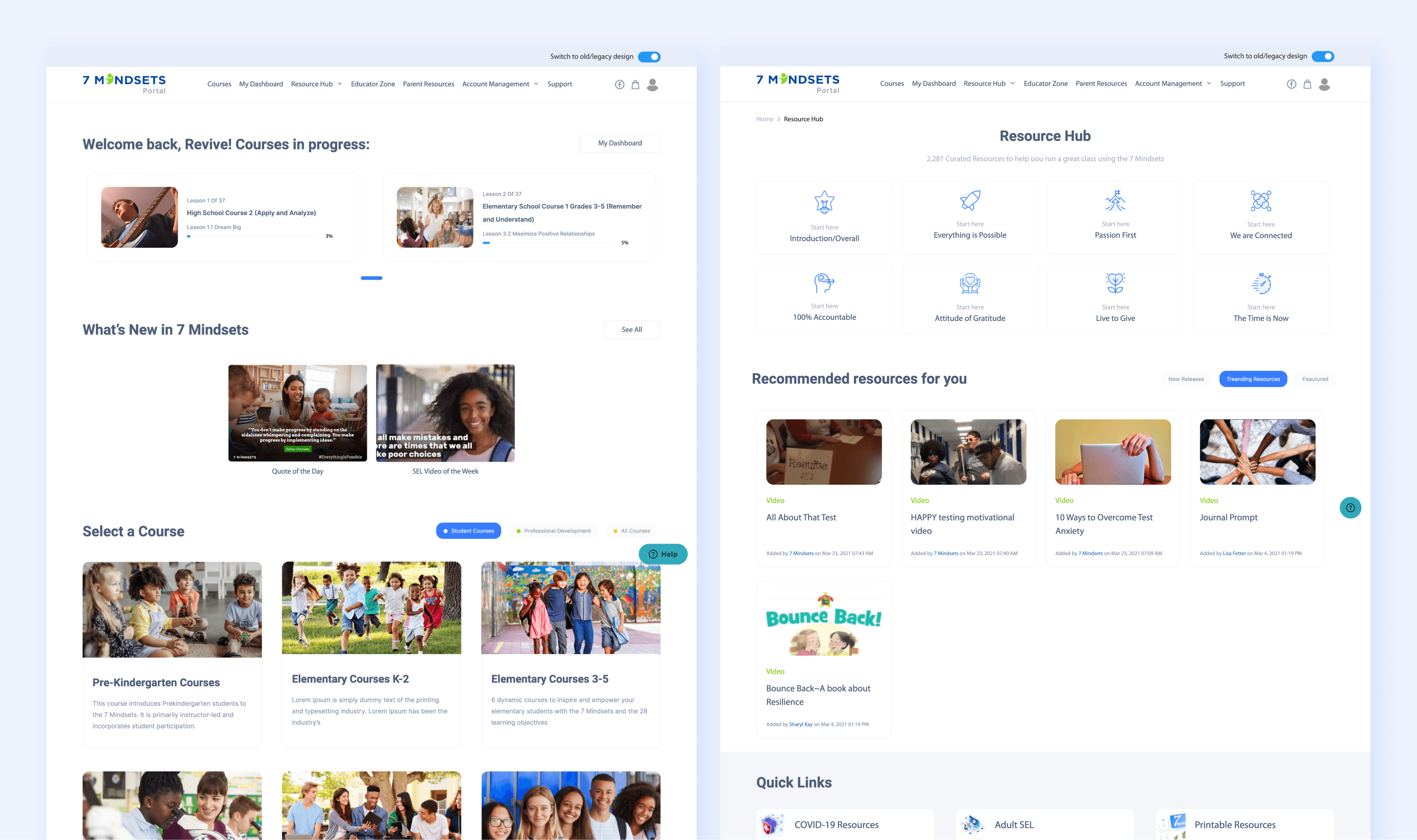
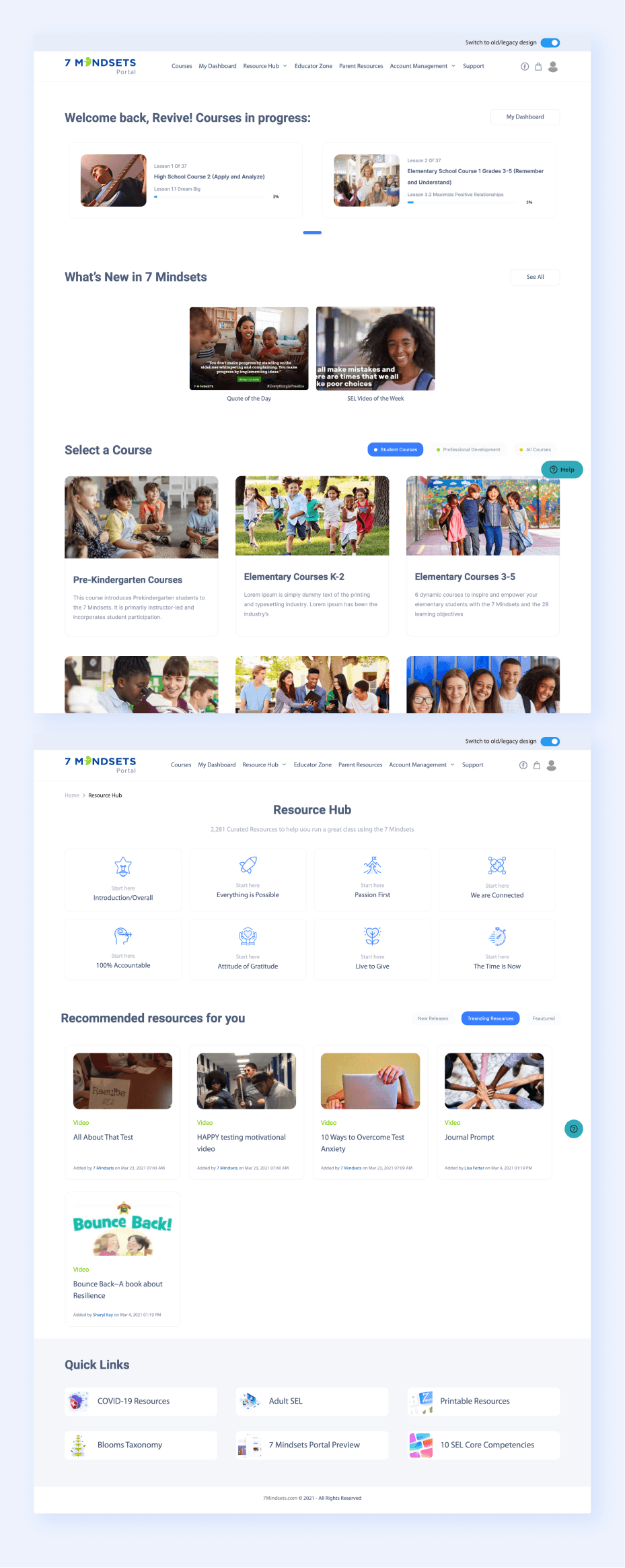
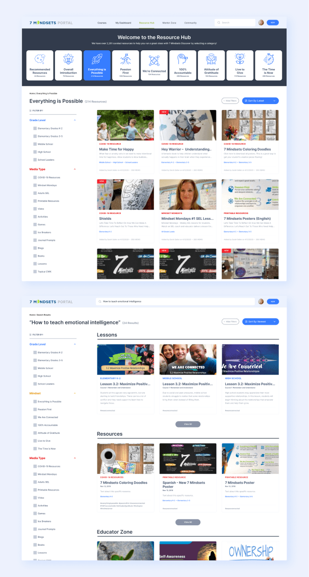
Former 7Mindsets Portal: Courses home page and Resource Hub.
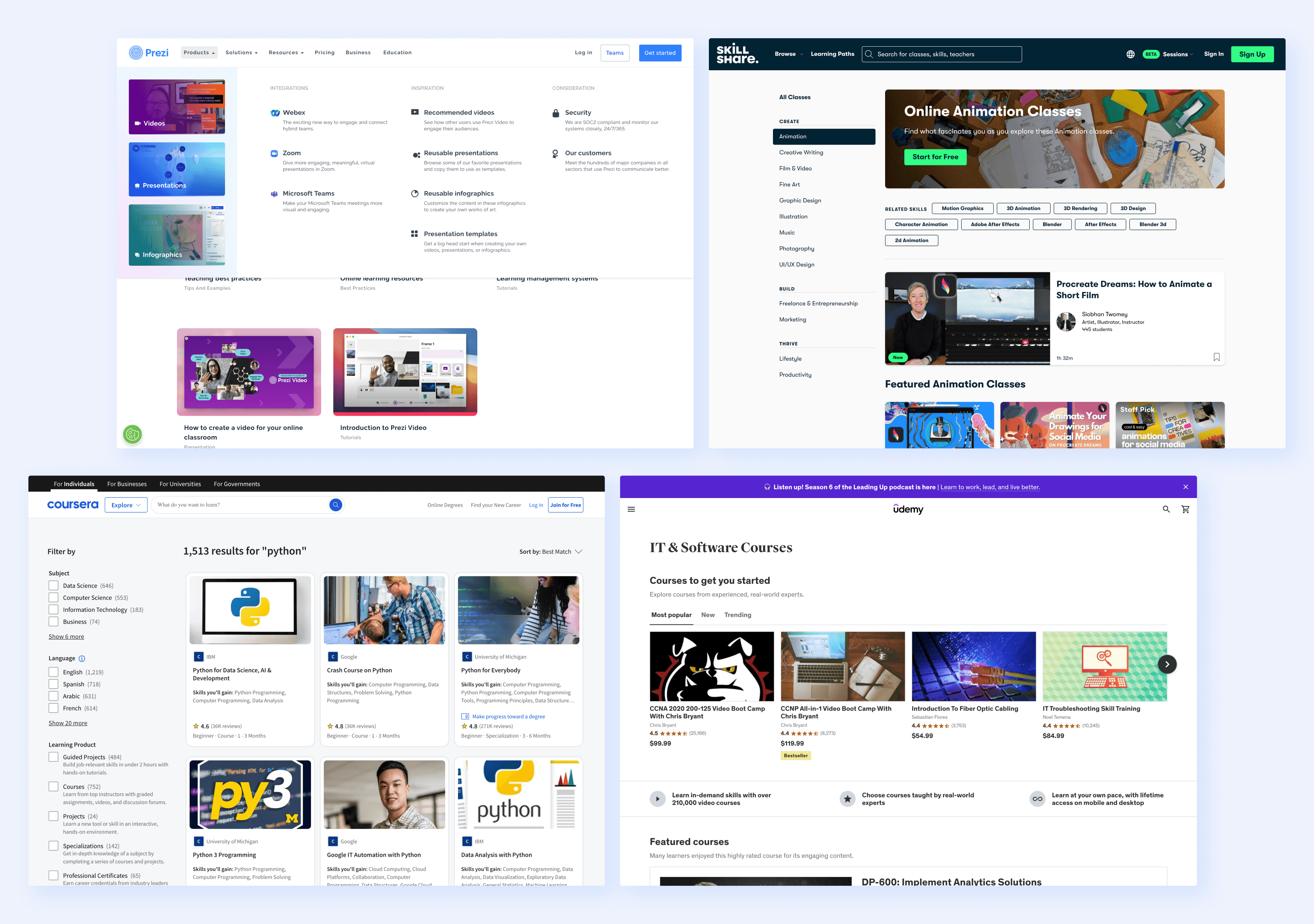
Looking at other education platforms to get inspiration and perspective: Prezi, Skillshare, Coursera, and Udemy.
Design rounds & Iterations
In the initial design rounds, we thought we had full freedom to rearrange content, such as moving the video and quote of the day into the navigation, and categorizing resources under global navigation and search. However, the developers preferred to reuse existing features and UI from the previous agency, leading to a more rigid design process.
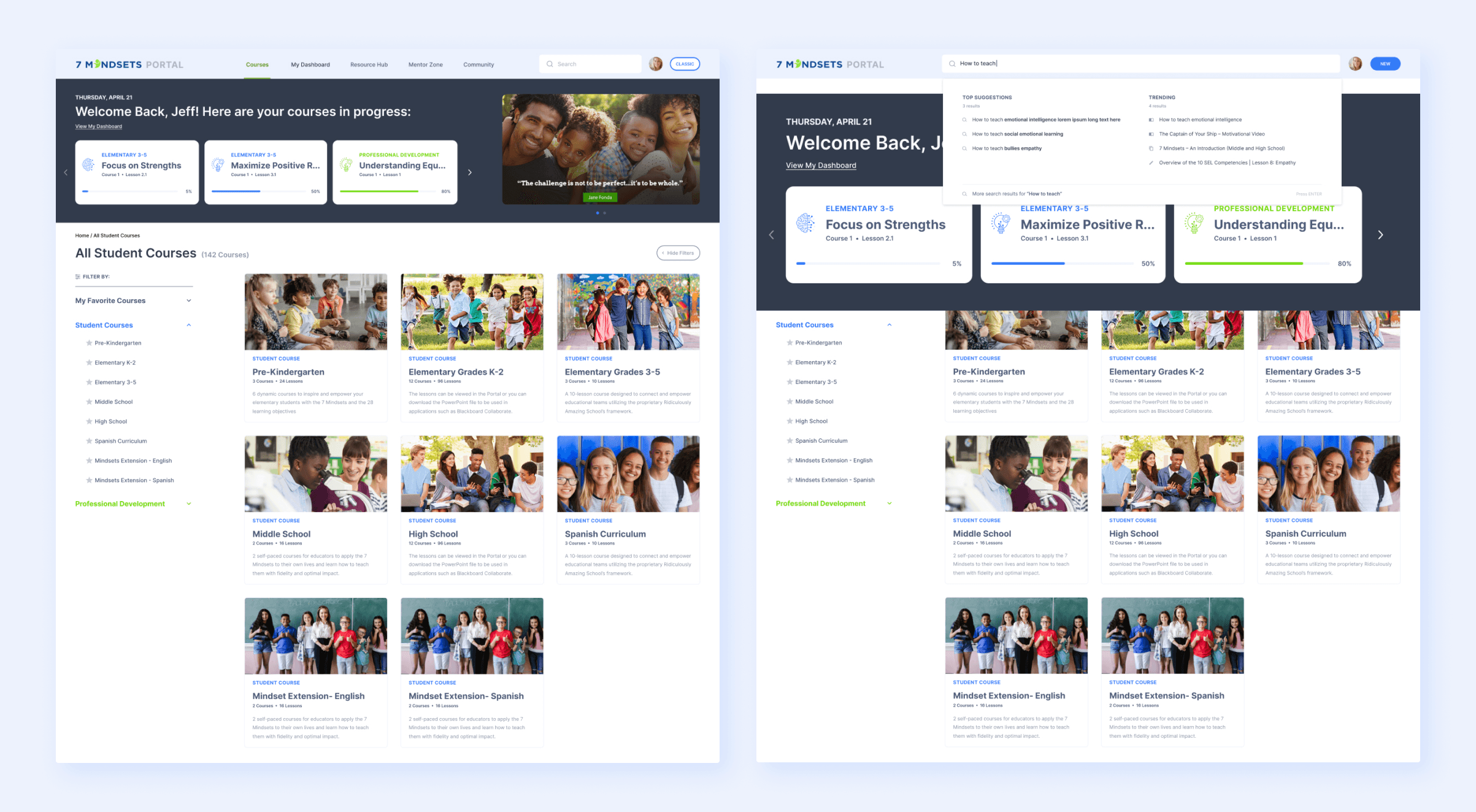
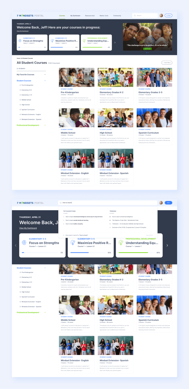
We ended up with a design featuring a header at the top of the page for "courses in progress" and the video + quote of the day, while the body housed the courses for easy navigation. We added a filtering feature to help users narrow their selections, addressing the issue of similarly named content.
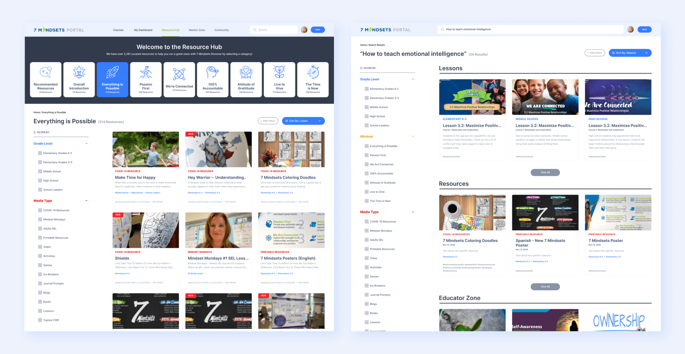
For the Resource Hub page, we iterated more quickly and received productive feedback from the product team and stakeholders. This gave us insight into how teachers use the portal and the importance of visible filtering option. We also learned that teachers needed to easily add resources to their lesson plans. We leveraged the previous style guide to color-code pages and topics, aiding older teachers in associating colors with specific meanings, like “blue” for grade level and “red” for resources.
We also aimed to implement a robust global search functionality for the portal. This smart search would parse through lessons, courses, and resources using keywords, providing a comprehensive results page to help users find what they need across the entire site.
Reformatting accessibility and discoverability for the Courses home page with constraints from the development team.
Utilizing more space through filters and navigation for the Resource Hub and Search.
Site Implementation & QA
We handed off the full designs to the developers via Figma, including detailed notes on specific nuances. The lead developer provided a QA environment to review any UI or UX adjustments. As is common, key UI details were initially missed. We compiled a comprehensive list of changes needed, but not all nuances were completed on time. Issues included font sizing, element sizing, and missing micro-details like rounded edges and spacing, affecting the overall design feel.
Managing expectations was crucial to maintaining the client relationship. Despite the challenges, the client expressed confidence and eagerness to work with my designs, finding the development process a fun and interesting challenge.
This was my second freelance project as a designer, and having prior experience, I had a better idea of what to expect. However, unlike my first project, I was now collaborating closely with the design director from the agency that hired me. This initially caused some confusion, but we quickly found a productive groove and effectively tackled client expectations together. Our joint presentations to stakeholders were well-received.
Given more time and budget, I would have preferred to validate designs through user testing and feedback, which is crucial for informing design decisions. Despite our limitations, we executed the project with the best possible approach using the existing resources, avoiding a complete reinvention of the wheel. I also learned that joining a project mid-way, especially for a complex learning platform, is challenging without a thorough understanding of the product and its users. With Phase 1 complete, the product team was eager to engage us for Phase 2 to tackle their “Empowering Educators” platform. We were happy to continue our partnership with 7Mindsets and build on our relationship.
