SKIN LAUNDRY
Website Rebrand
Giving new life to Skin Laundry's digital platform through a complete rebranding overhaul utilizing a headless CMS.
Website Glow Up
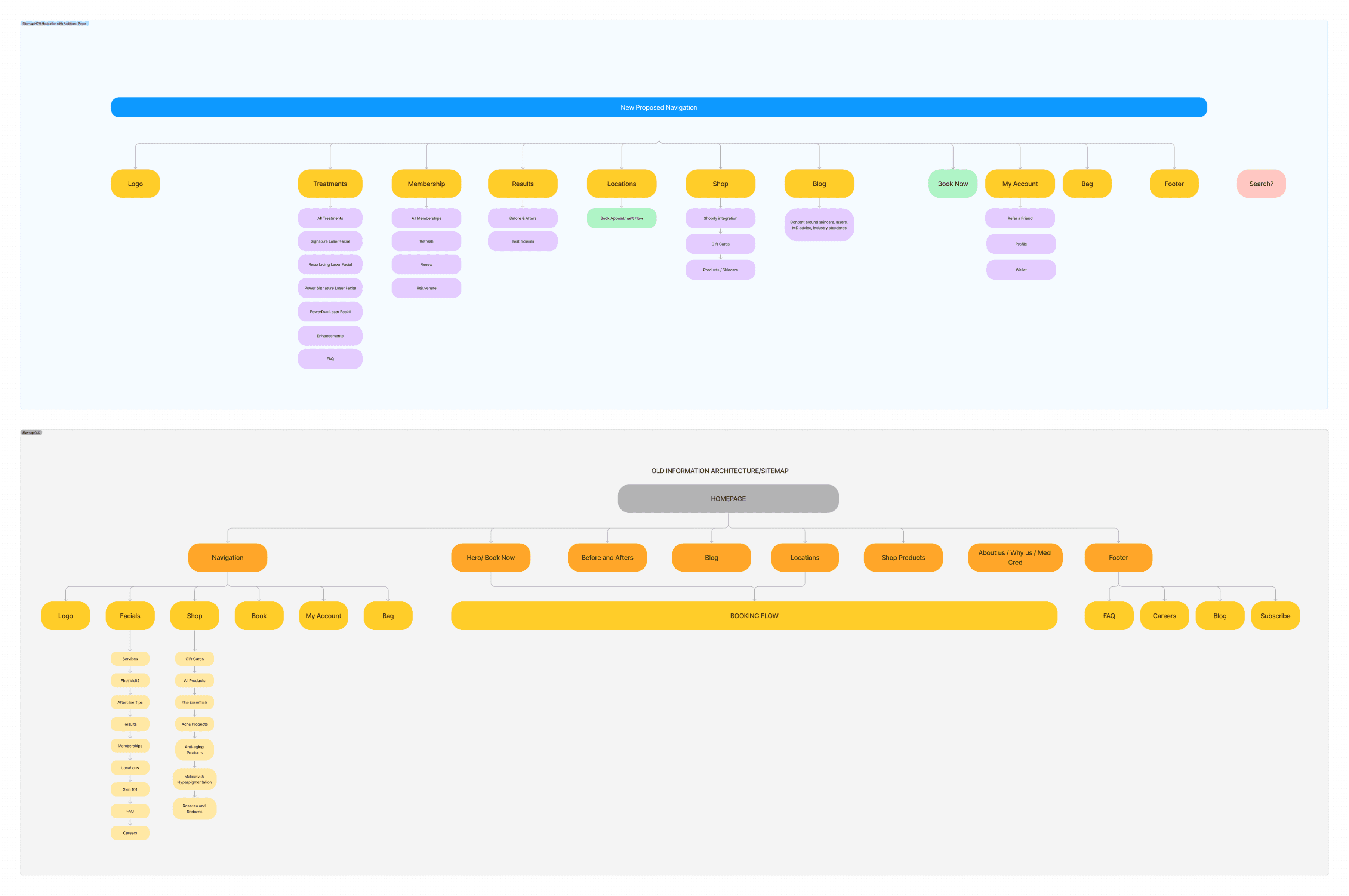
Old vs new Sitemap and reconfiguring the navigation to allow for new content pages.
Focusing on engagement
With a fast timeline and quick turn-around, we looked into several different key pages that we wanted to bring to the website having found that the old site was outdated and difficult to navigate. Bringing memberships and treatments more to the forefront to allow for users to find information easily and also integrating results of former clients to encourage users to book an appointment in clinic.
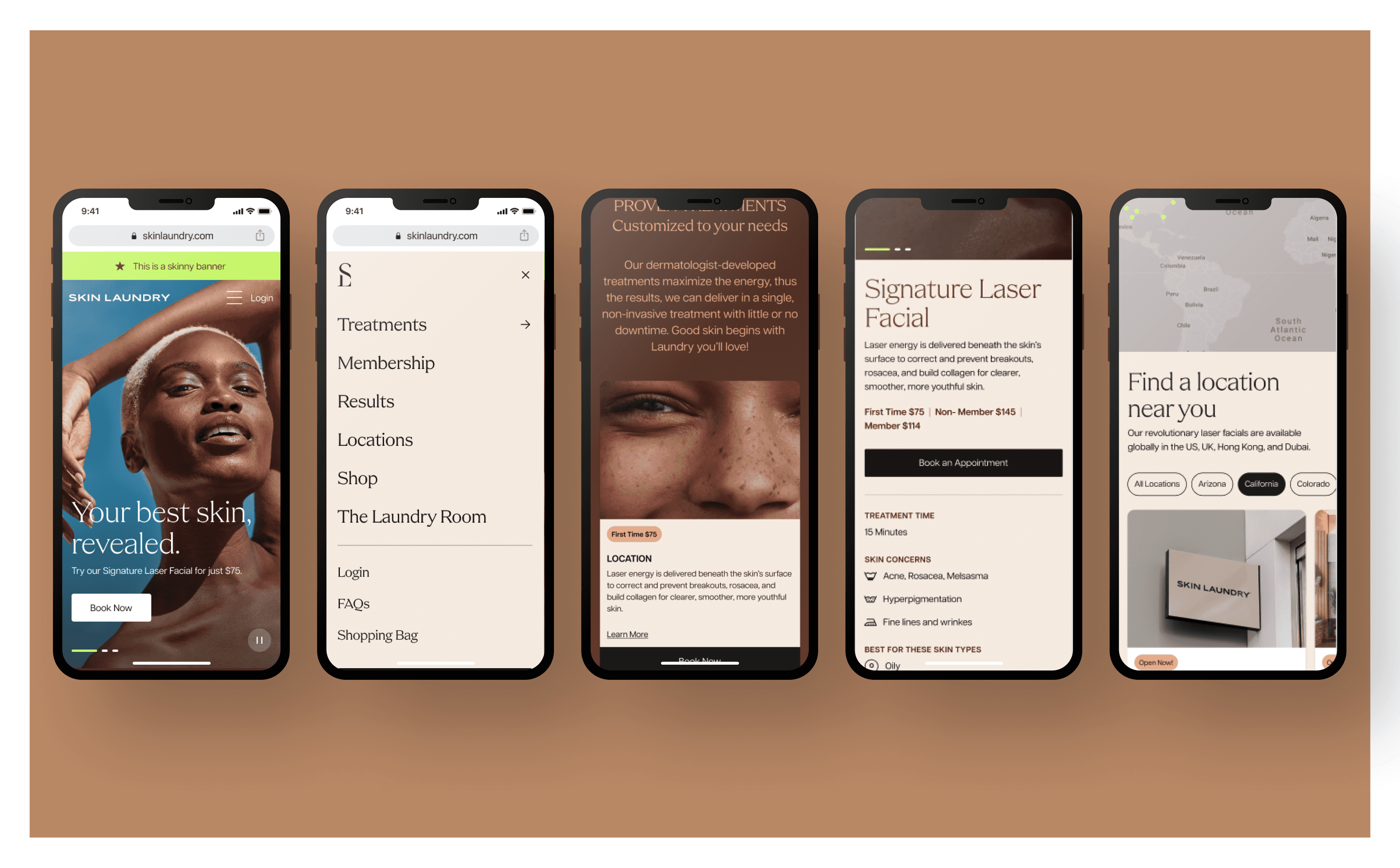
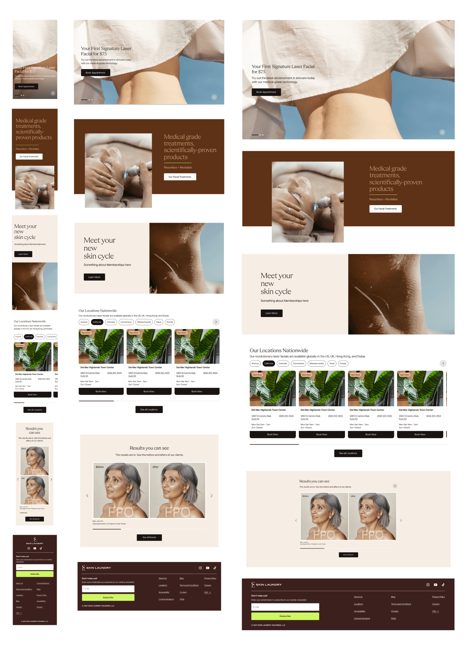
Mobile View: Homepage, Navigation, Treatments Page, and Locations.
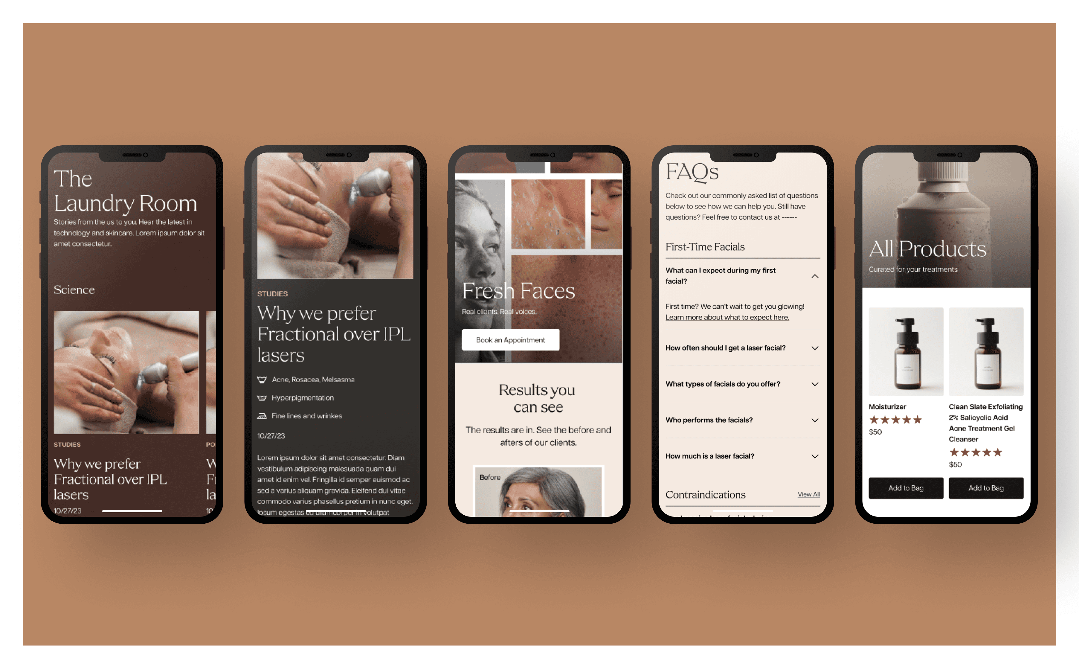
Mobile view: Blog, Results Page, FAQs, and Products.
Elevating Design through Color and Typography
An outside creative agency was hired to build a new brand book and overall look and feel for Skin Laundry. With the provided brand book, we experimented by taking the earthy brown tones with Skin Laundry's signature white and black to create a clean and minimal look for the website. The goal was to increase brand value with clientele who had higher earnings and would likely appeal to a more elevated brand. Photography was very important with clean shots of products and utilizing a fresh aesthetic with model shots. We focused on removing any unnecessary "kitschy" or "cute" elements that were found on the previous website version.
Creating a modular Design System
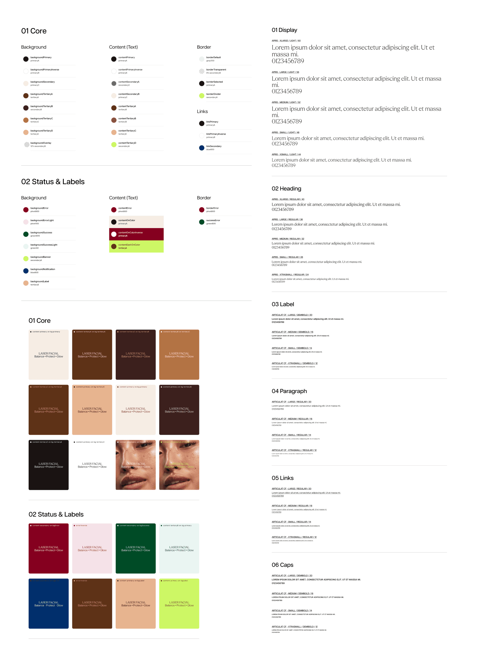
Taking the new branding, I converted the colors and typography into a token system following that of Google's Material Design and Atlassian's design systems. The intention was to create a fully usable system for not only the designers but also for the engineers to quickly make updates across the board.
From there we integrated the design system across the website and other digital assets while aligning with the overall marketing strategy. Due to Builder.io's flexibility to create and shift modular components into a template format, a complete component library was built. In total, we developed approximately 30 pages for a comprehensive revamp covering homepage, treatments, membership, locations, careers, shopping, footer/header/nav, and all necessary terms and conditions pages.
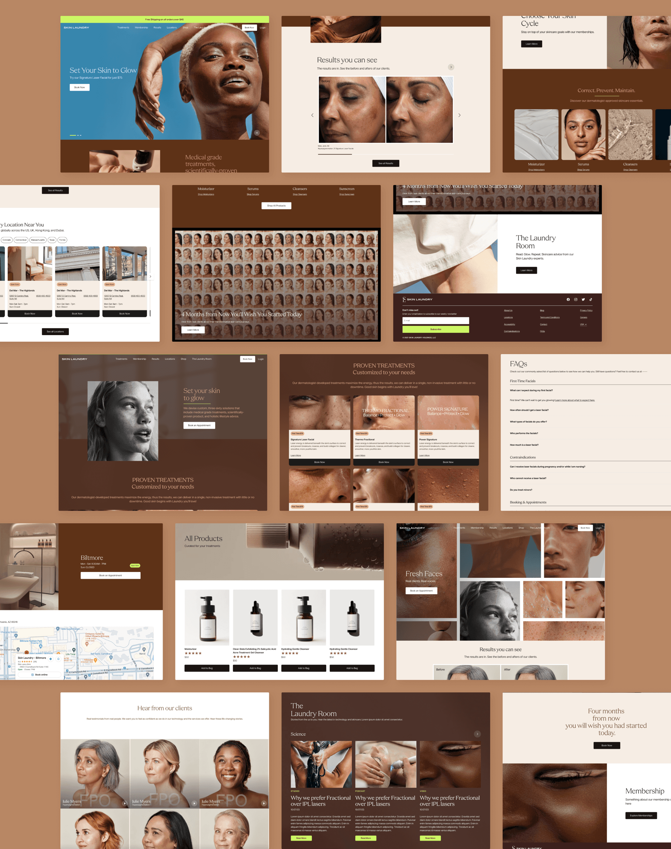
Desktop View: screens taken from the homepage, treatments page, FAQs, Products Grid, Results Page, Blog, and Locations.
Limited Resources and Cross-team collaboration
The team faced challenges due to the lack of dedicated QA resources and limited development capacity, relying on UX and product teams for QA. Aligning marketing content creation with website components required support to educate the marketing team on content integration. We helped the marketing team use Builder.io effectively, bridging technical gaps with their expertise.
Despite these challenges, the website was completed quickly and efficiently, with enhancements including a locations page with a custom Google API map for direct booking, streamlined copy on the membership page, a custom script component for efficient page tracking, and ADA compliance with an ADA widget.
